Let's Tour Italy!
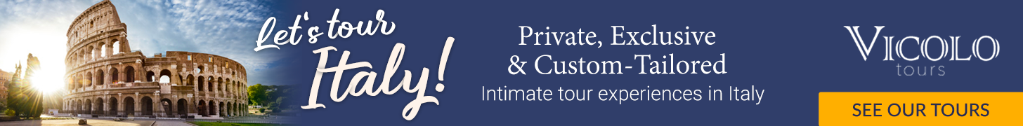
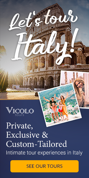
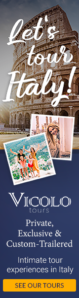
Redesigning a landing page and creating banner ads for an Italian touring company—bringing style and adventure to every click!
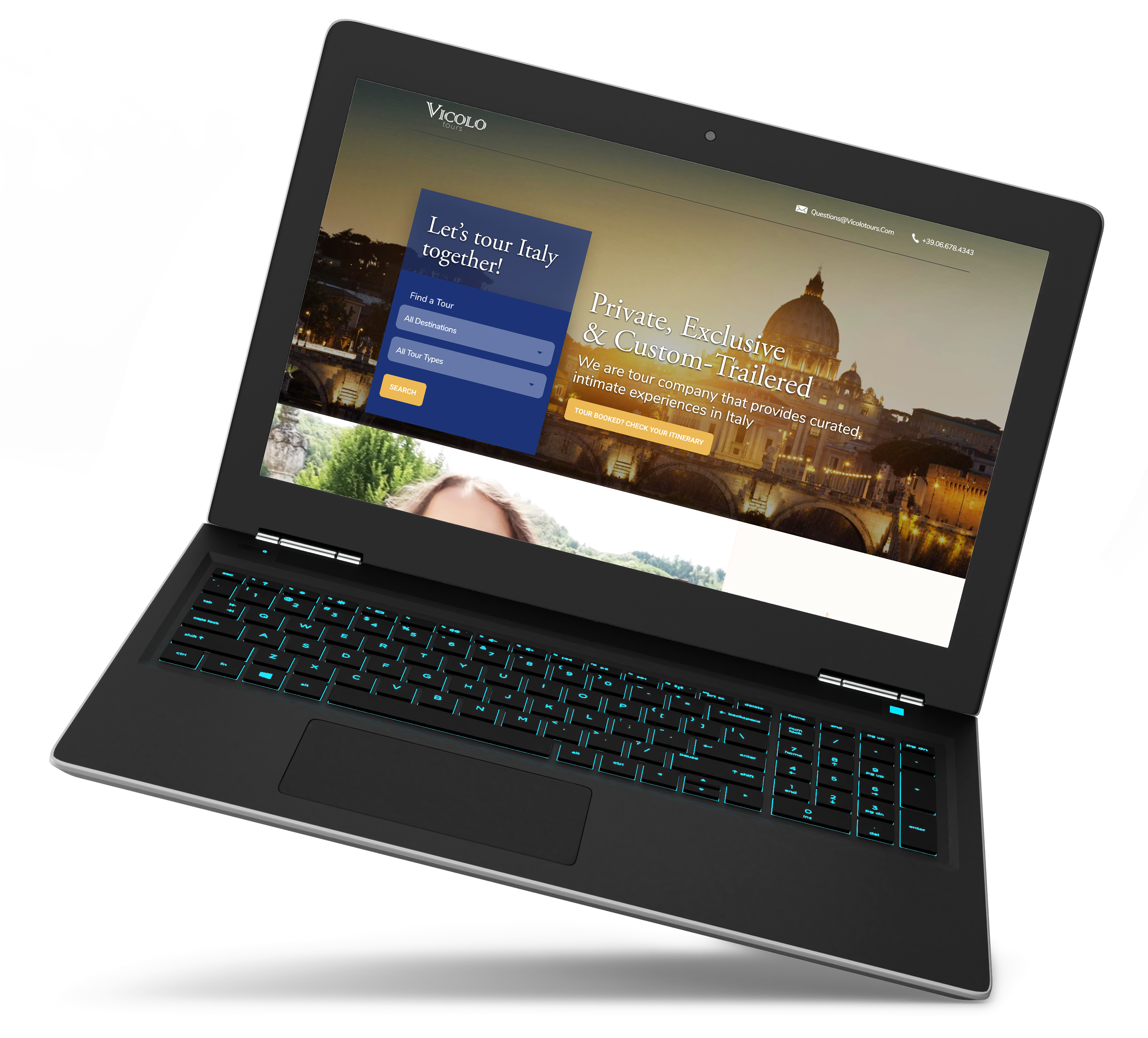
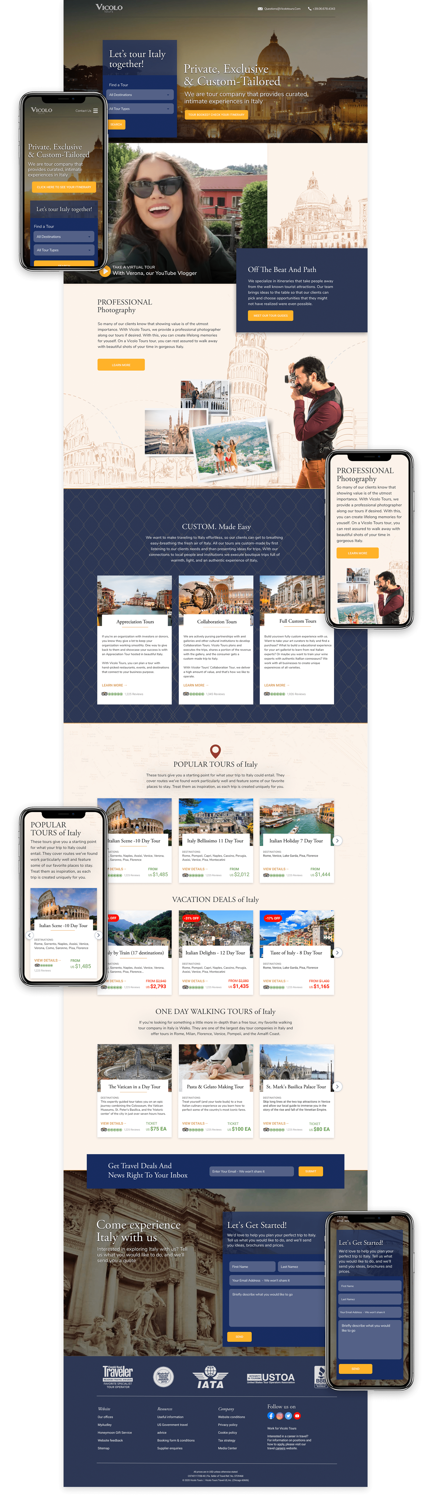
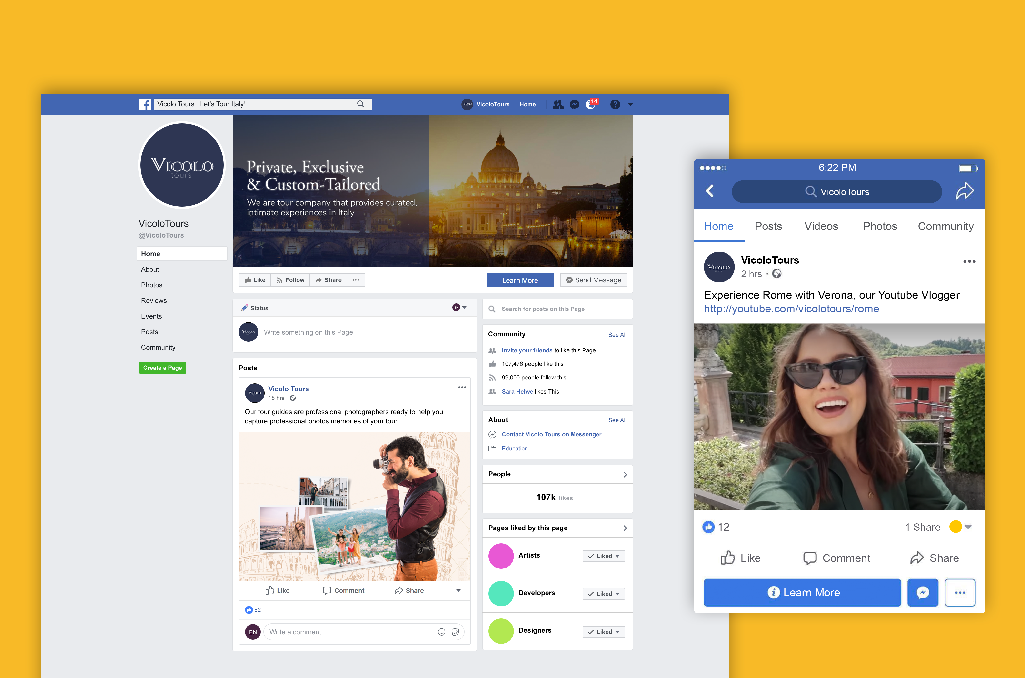
I created a one page mock up using Figma, then created a prototype using Webflow.

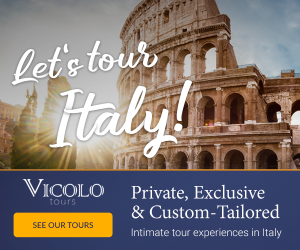
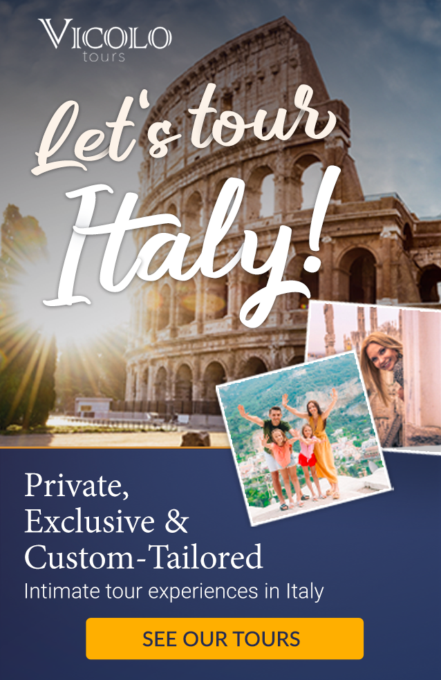
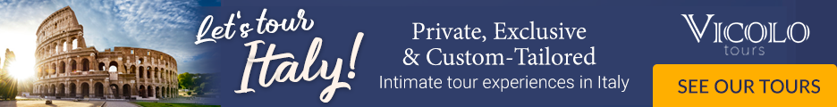
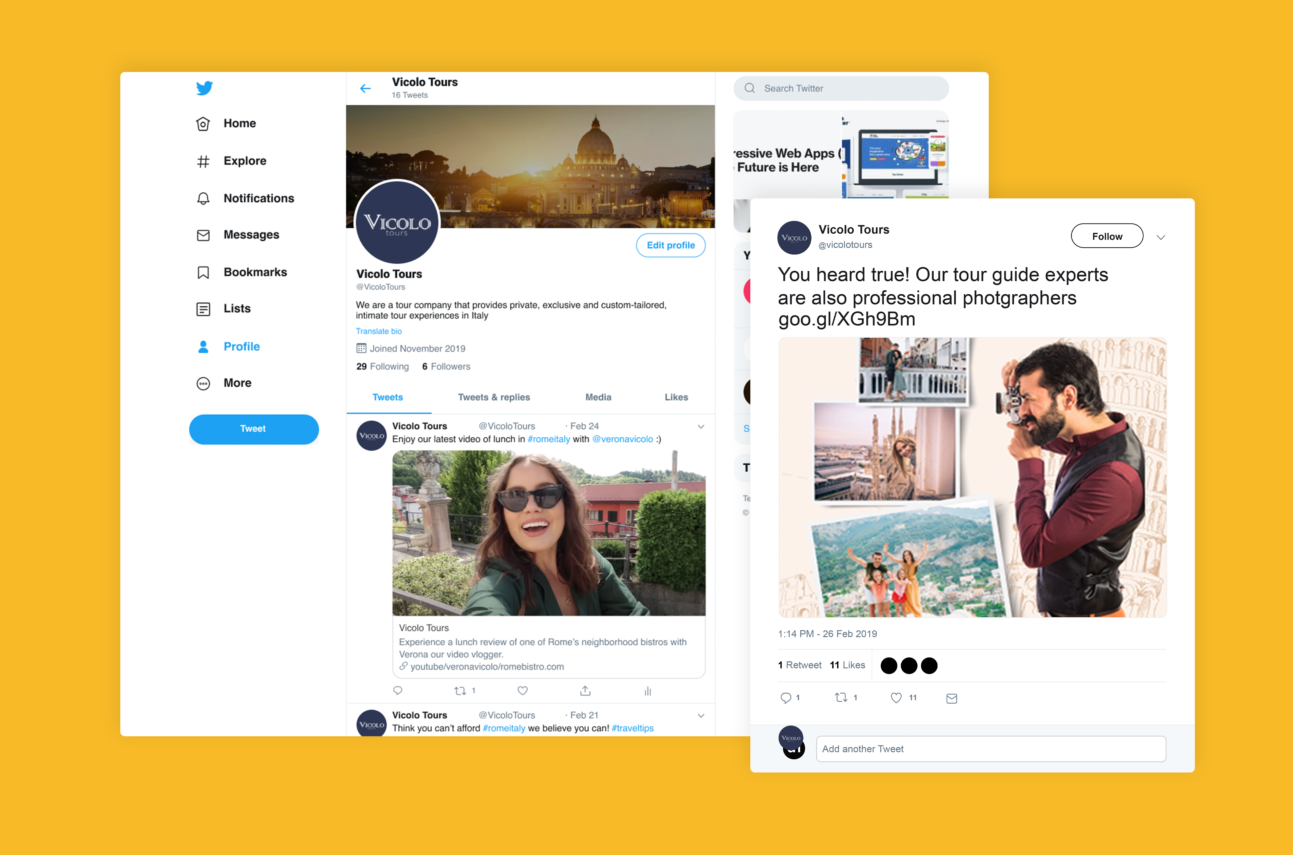
Vicolo Tours specializes in customized private tours across Italy. My client, Jeremy, felt the current website was too simple and lacked visual richness. He wanted the redesign to feel more luxurious—elegant but not overly extravagant. The goal was to immerse users in the essence of Italy without resorting to clichéd Italian-themed design. Additionally, the previous site’s maroon color scheme needed a fresh update, prompting us to explore new color options.
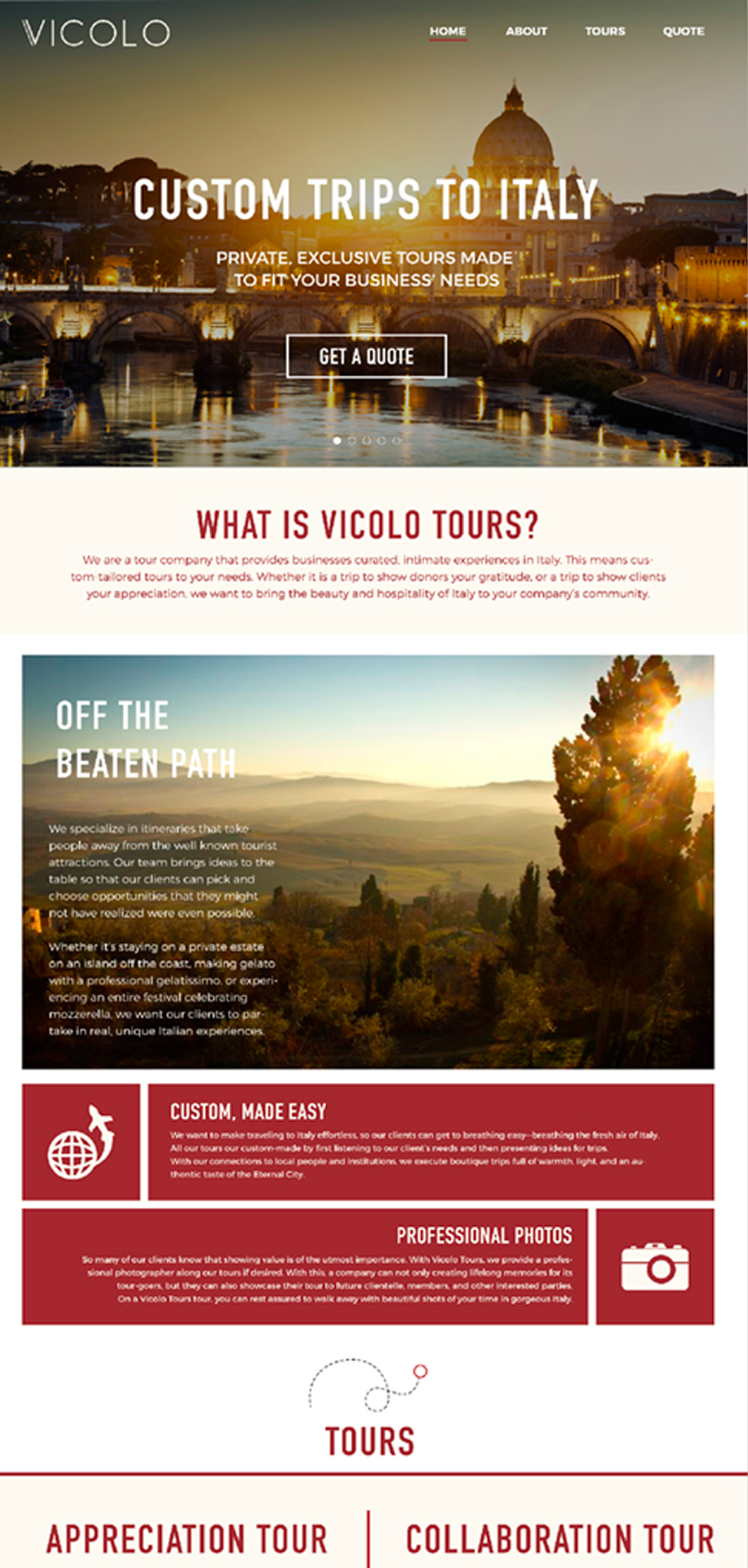
A Photoshop screenshot of the original landing page.
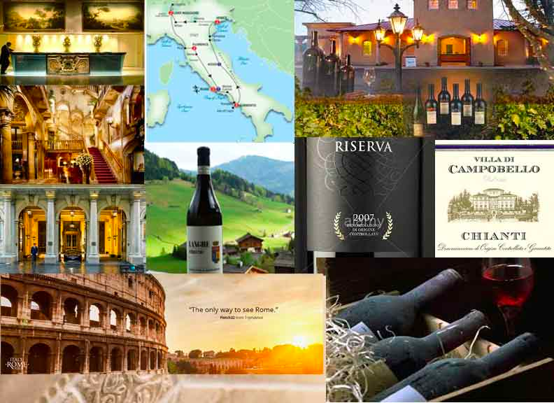
I began with a competitive analysis of travel and tour websites, drawing inspiration from luxurious five-star Italian hotels and restaurants. To define the visual direction, I curated a mood board filled with images and ideas that captured the desired look and feel.
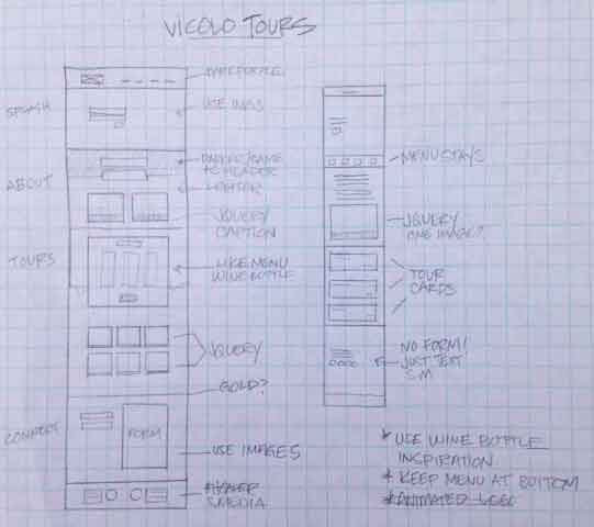
From there, I sketched a simple layout, mapping out text and image sections for desktop, tablet, and mobile devices.
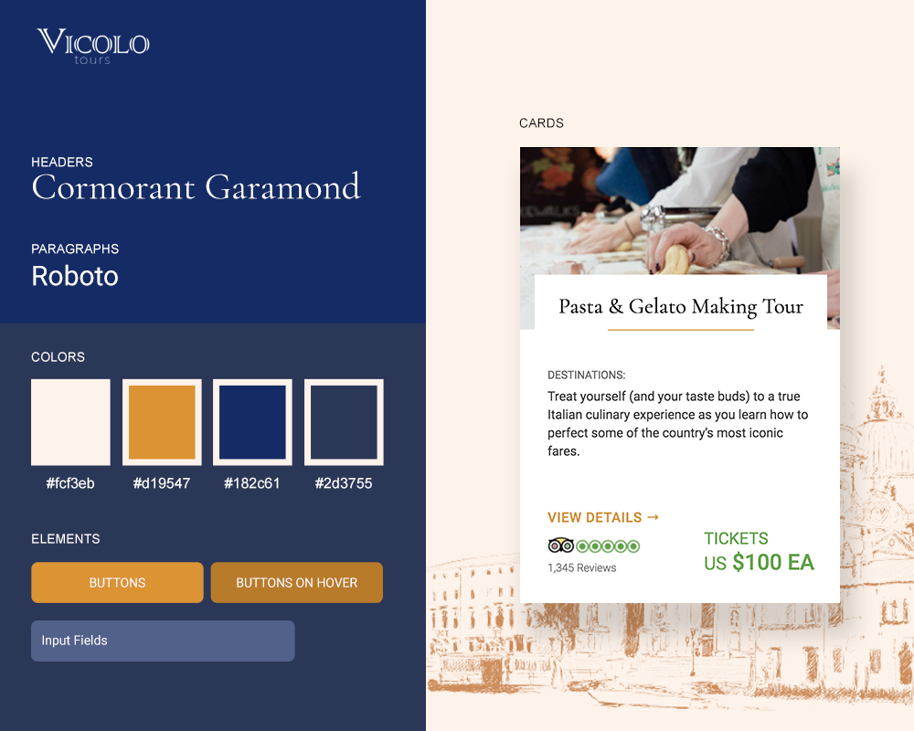
To achieve a luxurious look, I selected two shades of purple, a color often associated with royalty and elegance. These hues were sampled directly from an image of Italian vineyard grapes, adding an authentic touch. To bring energy, warmth, and a sense of adventure, I introduced a complementary orange. To balance the vibrancy of the purple and orange, I incorporated a neutral beige, inspired by the tones of Italian ceramic tiles, creating a refined and harmonious color palette.
An Italian-style font might have been the obvious choice, but since Jeremy wanted to avoid making the website look "too Italian," I took a different approach. I chose a serif font for the headers to add a touch of sophistication and a clean, modern sans-serif for the body text to ensure readability and balance.
The study bible marketers handed me three word documents containing light copy, a PDF sample excerpt and 3D graphics for the available editions. With the content in my hand, I began wireframing the landing page for desktop, tablet and mobile use.